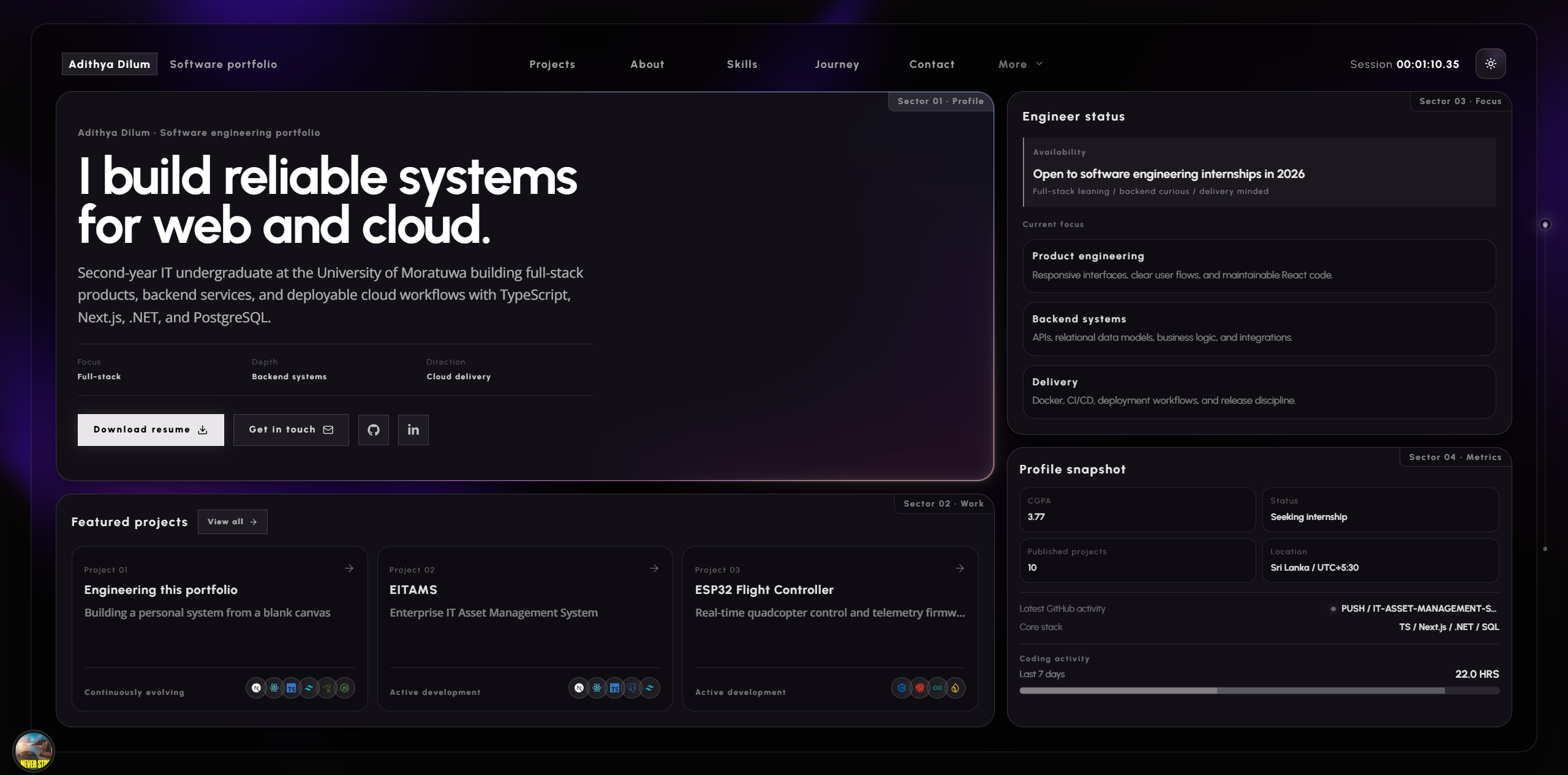
This portfolio did not begin with a finished design or a purchased template. It began as a question: how can a personal site feel like a real piece of engineering while still feeling unmistakably mine?
The answer emerged through many iterations. I rebuilt sections, changed the information hierarchy, discarded interactions that looked impressive but communicated little, and gradually turned a landing page into a small publishing and telemetry platform. The most valuable output was not a particular component. It was learning how visual design, content architecture, browser constraints, external APIs, and maintainability affect one another.
Starting from a blank canvas
The first challenge was direction. A portfolio can easily become a grid of familiar cards with a different accent color. I wanted this one to communicate an interest in systems, observability, and careful interfaces before a visitor read the first project description.
I built the initial visual language around an engineering dashboard:
- restrained telemetry labels and status markers;
- a strong typographic hierarchy instead of decorative clutter;
- subtle grids, traces, and orbital geometry;
- glass surfaces that preserve depth without hiding the content;
- motion that suggests a live system rather than a presentation deck.
That direction created its own constraint: every new section had to belong to the same system. The About section, project archive, contact artwork, blog, Blender gallery, loading sequence, and Spotify player could not feel like separate experiments placed on one page.
Turning visual ideas into a reusable system
Early versions repeated long groups of utility classes and slightly different card treatments. That made small theme changes risky. A border adjustment in one sector would leave five other sectors visually behind.
The solution was to identify the repeated decisions rather than only the repeated markup. Shared surfaces, glow behavior, typography roles, theme tokens, spacing rules, and breakpoint behavior became reusable components or global variables.
@theme {
  --font-sans: var(--font-open-sans);
  --font-mono: var(--font-urbanist);
  --font-serif: var(--font-source-serif);

  --color-background: var(--theme-bg);
  --color-foreground: var(--theme-fg);
}
The lesson was simple: a design system is not a collection of identical cards. It is a collection of consistent decisions that can produce different layouts.
The mobile version needed a different idea
The desktop hero was intentionally dense: multiple sectors share a dashboard window and communicate at a glance. Shrinking that composition for a phone produced cramped text, tiny telemetry, and unnecessary scrolling inside cards.
Instead of preserving the desktop screenshot, I preserved its priorities. On mobile:
- the hero becomes a natural document flow;
- secondary telemetry yields to identity and project access;
- navigation moves into an animated glass menu;
- dense desktop panels become simpler stacked sections;
- the dashboard shell becomes transparent rather than imitating a small application window.
This was one of the clearest lessons from the build: responsive design is often editorial prioritization, not geometric scaling.
Light mode was more than inverting colors
The dark interface was the original environment, so translucent whites, additive glows, and bright traces worked naturally. A mechanical color inversion made the light theme look washed out and turned several transparent surfaces into unexpected white blocks.
I treated light mode as a white engineering drawing. Shadows became quieter, lines became graphite-like, background effects used multiply blending, and the accent colors stayed visible without taking over the page.
The difficult part was the interaction between responsive utility classes and global theme selectors. A desktop-only class still exists in the DOM on mobile; a broad light-theme selector can therefore override the responsive rule at the wrong breakpoint. Fixing those cases taught me to scope theme overrides by both component and viewport instead of relying only on class-name matching.
Building content pipelines instead of hardcoded pages
Projects initially lived inside component data. Adding a case study meant editing TypeScript, creating a route, and updating several lists. That approach would become slower every time the archive grew.
The project, blog, and 3D showcase archives now use Markdown files with validated frontmatter. During the build, each registry:
- reads kebab-case content files;
- validates required metadata with useful source errors;
- excludes drafts;
- sorts published entries;
- generates static routes and SEO metadata;
- feeds the same data into cards, sitemaps, and structured data.
export function getAllProjectPosts(): ProjectPost[] {
  return getProjectFiles()
    .map(readProjectFile)
    .filter((project): project is ProjectPost => Boolean(project))
    .sort((a, b) => a.order - b.order);
}
This changed the mental model from “build another page” to “publish another document.” It also made invalid content fail during the build rather than becoming a broken production page.
Live data introduced distributed-system problems
The interface includes Spotify playback, WakaTime coding activity, and GitHub activity. These integrations appear small, but each adds a remote dependency with its own authentication, latency, response shape, and failure modes.
| State | Interface response |
|---|---|
| Credentials missing | Use a quiet inactive state |
| Request pending | Preserve layout without claiming data is live |
| Service unavailable | Degrade only the affected feature |
| Spotify paused | Hide the floating player |
| Track playing | Show progress, artwork, and restrained motion |
Secrets remain in server route handlers. The browser receives only normalized fields required by the interface. Most importantly, no telemetry failure is allowed to break the primary portfolio experience.
Motion needed rules
GSAP made it possible to build section reveals, timeline movement, draggable interactions, reading progress, menu transitions, and the footer glitch treatment. The harder decision was knowing where motion should stop.
I adopted a few rules during the project:
- motion should reveal hierarchy or explain state;
- repeating animation must remain peripheral;
- route content should be readable before an animation finishes;
- reduced-motion preferences must disable non-essential movement;
- mobile motion should use less distance and fewer simultaneous elements.
The floating Spotify player was a useful stress test. It needed to be draggable, snap to a corner, collapse around its album artwork, stay out of the content, and disappear when playback stopped. Each behavior was simple alone; the challenge was making them cooperate without the player jumping when its width changed.
Challenges that changed the architecture
Several problems pushed the project beyond its original structure:
Keeping a fixed project workspace usable
The project registry needed to remain within one viewport while still holding a growing archive. The final layout separates the fixed page shell from a dedicated scroll region with a visible custom scrollbar and a compact mobile card mode.
Supporting unknown future images
Markdown can reference local or remote media that does not exist when a component is authored. Article renderers therefore support runtime image paths, while gallery entries carry dimensions for optimized layout. Project covers now use the supplied image when available and generate animated artwork from the project accent colors when one is not.
Preserving performance with visual depth
Large canvases, blur, animated layers, image galleries, and scroll triggers can compete for the same rendering budget. Effects are kept fixed or isolated where possible, animations use transforms and opacity, ScrollTriggers clean themselves up, and mobile layouts remove decorative work that does not improve understanding.
Making every publishing surface searchable
Adding a route was not enough. Projects, articles, and showcase entries needed canonical URLs, Open Graph data, structured data, accessible image descriptions, and sitemap discovery. Those responsibilities now live close to the content pipeline rather than being remembered manually after publishing.
What building it taught me
The project strengthened technical skills, but the larger lessons were about judgment:
- A strong visual idea needs an equally strong content hierarchy. A beautiful surface cannot rescue unclear writing.
- The best responsive version may use a different composition. Protect the message, not the screenshot.
- Content deserves engineering. Validation and conventions make future publishing dramatically easier.
- Failure states are part of the design. Live services should add life without becoming structural dependencies.
- Animation needs a reason. Restraint makes meaningful motion feel more effective.
- Theme work exposes hidden coupling. Light mode revealed assumptions that the dark design allowed me to overlook.
- Iteration is architecture work. Repeated visual friction often points to a missing abstraction, not just a missing CSS rule.
An intentionally unfinished system
The portfolio is deployed, but it is not “done.” Its value is that it can grow without requiring a redesign for every new project, article, or render. The pipelines are templates for future writing, the components provide a stable visual language, and the live integrations can fail without taking the experience with them.
That is the outcome I value most: not a static personal page, but a system I understand well enough to keep evolving.